Contents
|
Available tools for memory and sleep analysis
To study your memory and sleep, use options available in SuperMemo in the following places:
Examples
Tools : Workload
You can use Tools : Workload (Ctrl+W) to inspect the daily and the monthly calendar of repetitions. You can view the number of repetitions scheduled, number of scheduled topics, number of scheduled items, as well as the record of past repetitions, and past retention, or how many new items were memorized.
Daily workload
Monthly workload
Tools : Memory : 4D Graphs
Figure: A 3D graph of SInc[] matrix made regular by checking Average and rotated around the Stability increase axis (vertical). The graph is based on 272 repetition cases (all data points included) for items with difficulty=0.05. The Average checkbox helps you extract best data using data-rich neighboring entries and theoretical SInc[] predictions where no data is available. This is particularly useful for scarce data in new collections (as the one used in the picture)
Tools : Statistics : Analysis
You can use Tools : Statistics : Analysis (Shift+Alt+A) to inspect your forgetting curves, daily changes to your measured forgetting index, superiority of the latest Algorithm SM-17 over the previous generation spaced repetition algorithm, your learning overload, and many more:
Forgetting curves
Typical exponential forgetting curve
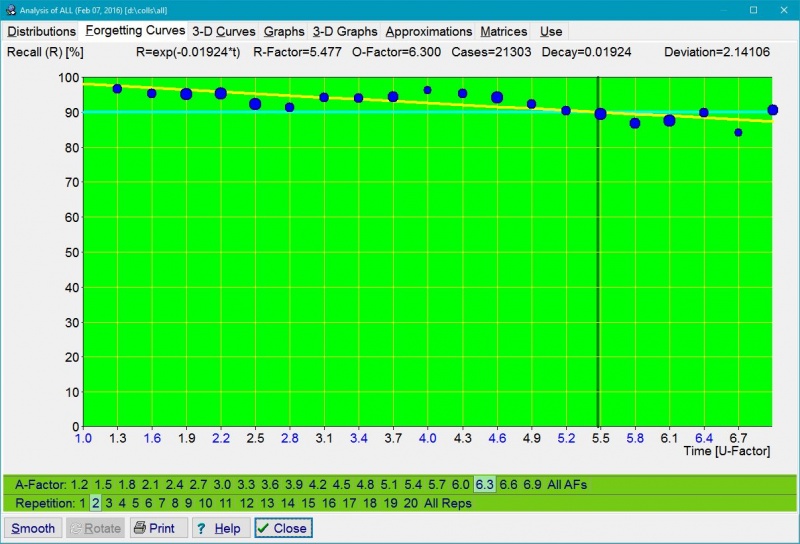
Figure: Tools : Statistics : Analysis : Forgetting Curves for 20 repetition number categories multiplied by 20 A-Factor categories. In the picture, blue circles represent data collected during repetitions. The larger the circle, the greater the number of repetitions recorded. The red curve corresponds with the best-fit forgetting curve obtained by exponential regression. For ill-structured material the forgetting curve is crooked, i.e. not exactly exponential. The horizontal aqua line corresponds with the requested forgetting index, while the vertical green line shows the moment in time in which the approximated forgetting curve intersects with the requested forgetting index line. This moment in time determines the value of the relevant R-Factor, and indirectly, the value of the optimum interval. For the first repetition, R-Factor corresponds with the first optimum interval. The values of O-Factor and R-Factor are displayed at the top of the graph. They are followed by the number of repetition cases used to plot the graph (i.e. 21,303). At the beginning of the learning process, there is no repetition history and no repetition data to compute R-Factors. It will take some time before your first forgetting curves are plotted. For that reason, the initial value of the RF matrix is taken from the model of a less-than-average student. The model of average student is not used because the convergence from poorer student parameters upwards is faster than the convergence in the opposite direction. The Deviation parameter displayed at the top tells you how well the negatively exponential curve fits the data. The lesser the deviation, the better the fit. The deviation is computed as a square root of the average of squared differences (as used in the method of least squares).
First review forgetting curve
Figure: The first forgetting curve (first repetition for items with no lapses). Unlike it was the case in earlier SuperMemos, where all forgetting curves were exponential, the first forgetting curve in SuperMemo 17 is approximated using power regression. This provides for a more accurate mapping due to the heterogeneity of the learning material introduced in the learning process that results in superposition of exponential forgetting with different decay constants. The use of power regression explains why the first interval might be slightly shorter in Algorithm SM-17. On a semi-log graph, the power regression curve is logarithmic (in yellow), and appearing almost straight. The curve shows that in the presented collection recall drops merely to 58% in four years, which can be explained by a high reuse of the memorized knowledge in real life. In earlier SuperMemos, recall data would only be collected in the span of 20 days, and negatively exponential forgetting curve would make for far lower retrievability predictions. The first optimum interval for the forgetting index of 10% is 3.76 days. The forgetting curve can be described with the formula R=0.987*power(interval,-0.07), where 0.987 is the recall on Day 1, while -0.07 is the decay constant. This is case, the formula yields 89.5% recall after 4 days, which is then used as the first rounded optimum interval. Almost 77,000 repetition cases were used to plot the presented graph. Steeper drop in recall will occur in collections with a higher mix of difficult items, in poorly formulated collections, or in new users with lesser mnemonic skills.
Daily changes to the measured forgetting index
Figure: Exemplary graph enabling a more meaningful analysis of the forgetting index. Changes to forgetting index in Analysis use the daily measured forgetting index (previously: less informative cumulative measured forgetting index value was taken for the entire period since the last use of Tools : Statistics : Reset parameters : Forgetting index record). Note that the priority queue may distort the actual retention in your collection as measured values are primarily taken from top-priority material. Thus measured forgetting index should be understood as "forgetting index measured at repetitions", not as "overall measured forgetting index".
Use : Efficiency : SM16/SM17 Metric
Figure: R-Metric graph demonstrates superiority of Algorithm SM-17 over the old Algorithm SM-15 for the presented collection used in the testing period of 12 months before the release of SuperMemo 17. It was plotted using 10,699 data points (i.e. repetition cases with data from both algorithms), and smoothed up to show the trends. One spot beneath the line of 0 at the vertical axis (R-metric<0) corresponds with a moment in time when the previous version of the algorithm appeared superior (in this case, due to a small sample of repetitions). Some positive and negative trends correspond with changes in the algorithm as data were collected in the new algorithm's testing period. A gradual increase in the metric in the months Feb-May 2016, might be a statistical aberration, or it might be the result of new interval values and a bigger R-metric for intervals departing from the optimum used in earlier SuperMemos. The latter might indicate that the benefits of Algorithm SM-17 might gradually increase over time.Priorities missed due to overload
Tools : Statistics : Statistics
You can use Tools : Statistics : Statistics to supervise and understand your learning process:
Tools : Statistics : Element data
You can use Tools : Statistics : Element data to inspect learning statistics of a given element:
You can use Learning : Statistics : Show repetition history (Shift+Ctrl+H) (on the element menu) to inspect the history of repetitions for individual elements:
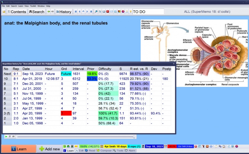
Figure: Repetition history dialog box displaying the history of repetitions for the current element. In this example, no data before the 5th repetition is a result of the fact that the repetition history was collected in SuperMemo only as of 1996, while the presented collection is much older (with 4 repetitions executed before or in 1996). Also, the hour data is missing in older repetitions due to the fact that the repetition hour is registered in repetition history only as of SuperMemo 2006 (hours are used in correlating retention with sleep data available from SleepChart).
Repetitions graph
Repetitions graph for any subsets of elements can be shown in the browser with Tools : Repetitions graph on the browser menu:
Figure: The horizontal axis corresponds with the repetition number and the vertical axis represents intervals (logarithmic scale). Despite a popular belief, the semi-log scale does not produce a linear graph here. Clearly the increase in the length of intervals slows down with successive repetitions. Moreover, the graph corresponding with zero lapses (red curve), results from the superposition of items with lower and faster increase in intervals (determined by difficulty). The bell-shaped curve is determined by all contributing items (below repetition number 10) and then only by difficult items or items with low forgetting index for which the increase in the length of intervals is significantly slower (above repetition 10). To see the above graph in your own collection, use Tools : Repetitions graph on the browser menu
Tools : Sleep Chart
You can use Tools : Sleep Chart (F12) to optimize the timing of your sleep as well as the timing of your learning:
Sleep and repetitions timeline
Inspect the timeline of repetitions and sleep:
Figure: Sleep and learning timeline. Sleep blocks are marked in blue. Learning blocks in red. Total learning time on individual days is displayed on the right. The currently selected sleep block turns yellow. Its length is displayed at the bottom. A sleep block whose color bleeds from blue into pink denotes interrupted sleep (e.g. with an alarm clock). A sleep block with the color changing from black to blue marks a delayed sleep episode (e.g. caused by watching a late tennis match).
Look for the best time for learning or sleep (see Sleep Chart for details):
Figure: Sleep and repetitions timeline displaying repetitions blocks of the current collection (in red) and sleep blocks (in blue) with recomputed circadian approximations on the current data. Blue and red continuous lines are predictions of optimum sleep time using the SleepChart model (based on sleep statistics). Yellow continuous line shows the prediction of the maximum of circadian sleepiness (circadian middle-of-the-night peak) using a phase response curve model. Note that, theoretically, the yellow line should roughly fall into the middle between blue and red lines. However, when a disruption of the sleep pattern is severe, those lines might diverge testifying to the fact that it is very hard to build models that fully match the chaotic behavior of the sleep control system subjected to a major perturbation. Aqua dots point to the predicted daytime dip in alertness (i.e. the time when a nap might be most productive).
Alertness
See how your brain gradually loses its power during the day:
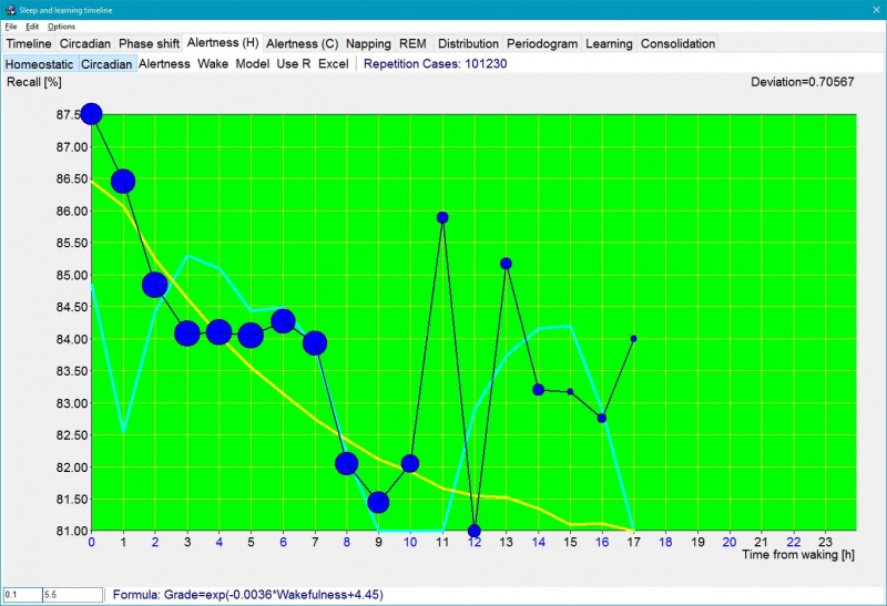
Figure: Tools : Sleep Chart : Alertness (H) graph makes it possible for you to visually inspect how recall (and grades) decrease during the waking day. It also shows the impact of circadian factors with grades slightly lower immediately after waking and slightly higher after the mid-day dip in the 9th hour. The blue dots are recall data illustrating decline in performance during a waking day from 87.5% at waking to 81.5% at midday nadir (size of the circles corresponds with the number of repetitions collected, where minimum 50 repetitions are needed to paint a circle in this particular graph). The yellow line is the estimated homeostatic alertness derived from the sleep log data. The aqua line represents the circadian alertness estimate derived from the same sleep log data. Recall is a resultant of the impact of both sleep-drive processes: homeostatic (yellow) and circadian (aqua). 0.1 (hours) (at the bottom) is the minimum sleep block length taken into consideration. 101,230 repetitions cases were taken to plot the graph. The Deviation parameter displayed at the top tells you how well the chosen approximation curve fits the data (in the picture: negatively exponential recall curve). The lesser the deviation, the better the fit. The deviation is computed as a square root of the average of squared differences (as used in the method of least squares). Depressed Use R will use grade-R correlations for an average student to estimate recall (R derived from the DSR model is not used here, as on the Alertness (C) tab, due to the slowness of the computation). Those correlated R figures may differ from actual recall
Two-component sleep model
Look for the time of the day that should give you maximum learning power (Shift+click a day in the sleep timeline). See when your learning is not likely to be effective and when you should rather go to sleep:


![SuperMemo: A 3D graph of the smoothed up SInc[] matrix rotated along the X (Retrievability) axis based on 272 repetition cases for items with difficulty=0.05](images/thumb/1/10/Smoothed_up_stability_increase_function.jpg/800px-Smoothed_up_stability_increase_function.jpg)


